
Brand Development
Background
If you’re a fan of rugby you will already be aware of the Barbarians. A rugby football club that has been doing things differently since their founder, William Percy Carpmael set out on his singular mission to spread good fellowship, camaraderie and a trademark style of attacking rugby built on flair, courage and passion on the field.
William’s vision resulted in an invitation only touring team made up of the greatest rugby football players representing the Club from around the world. For over 130 years Barbarian F.C have taken this approach and are unique in that they have no ground, no clubhouse, no entry fee and no subscriptions.
The Challenge
The culture of the Barbarians was firmly rooted in men’s rugby, however Chairman, John Spencer had a vision to develop an inspiring global brand to inform the rugby public about the Barbarians:
“We’re really proud of our history and tradition which has helped shape our identity as a unique Rugby Football club. But things have changed, and now we stand for much more than just the innovative concept behind our formation back in 1890. We’ve become a globally recognised name that represents the spirit and passion for rugby. We are committed to inclusivity, with our Women’s and Schools’ team and our Charitable Trust helping us reach new communities. We have no barriers to nationalities or beliefs.
John Spencer Chairman, Barbarians
The Barbarians commissioned Totally.Digital to create a website to promote the breadth and scope of the club’s brand and global activities. Brand Consultant, Bill Wallsgrove was invited in to review their brand story and articulate their vision.

The Barbarians jersey has always consisted of black & white hoops worn with black shorts and the player’s own club socks. In the club’s inaugural season the badge consisted of a skull and cross bones which represented ‘The Rebels’. This was updated the following year to a woven motif composed of ‘B.F & C.’ intertwined which is still displayed on the club shirts to this day.
During the brand workshop phase it became clear that the long-standing badge didn’t reproduce well in print or on screen. In response we were commissioned to develop a digital first brand identity which could scale at all sizes, across all communication platforms. What resulted was a solution where the ‘B’ has been brought to the fore rather than being hidden in the layers of letters, giving it more clarity and prominence.
We’ve now supported this process by producing the club’s very first brand guidelines which articulate the club’s new vision, heritage and visual brand language. The guidelines provide guidance to all partners and sponsors about how to communicate to their global fanbase and the wider rugby community.

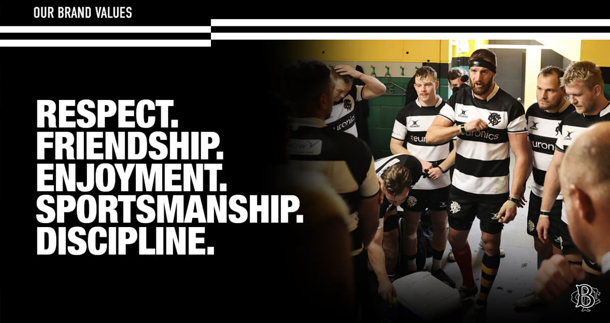
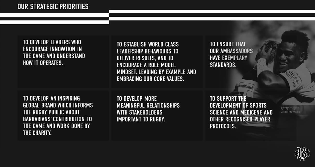
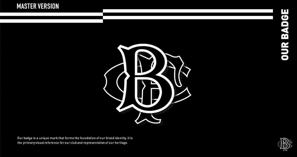
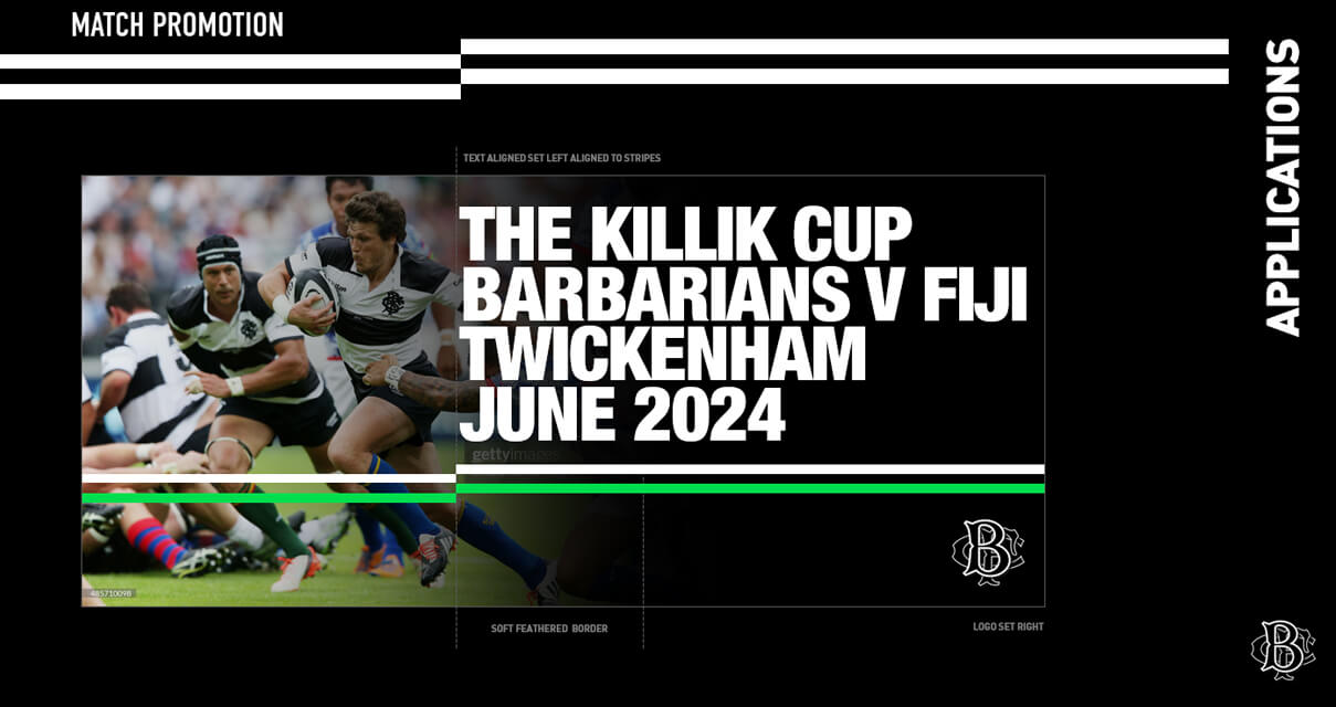
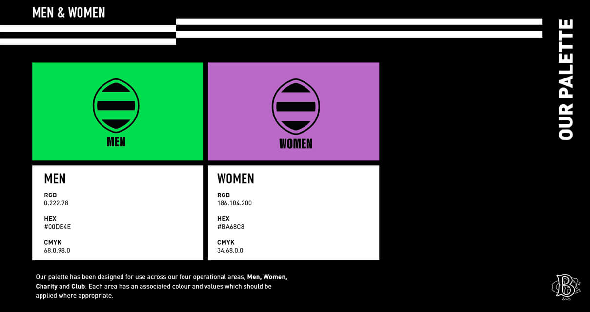
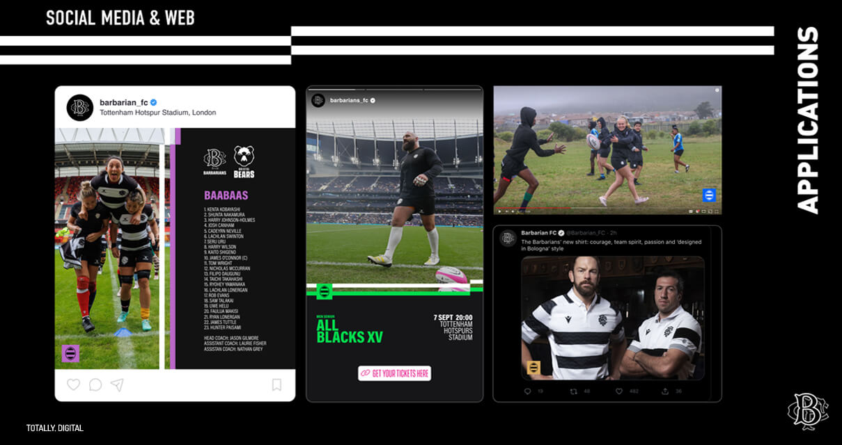
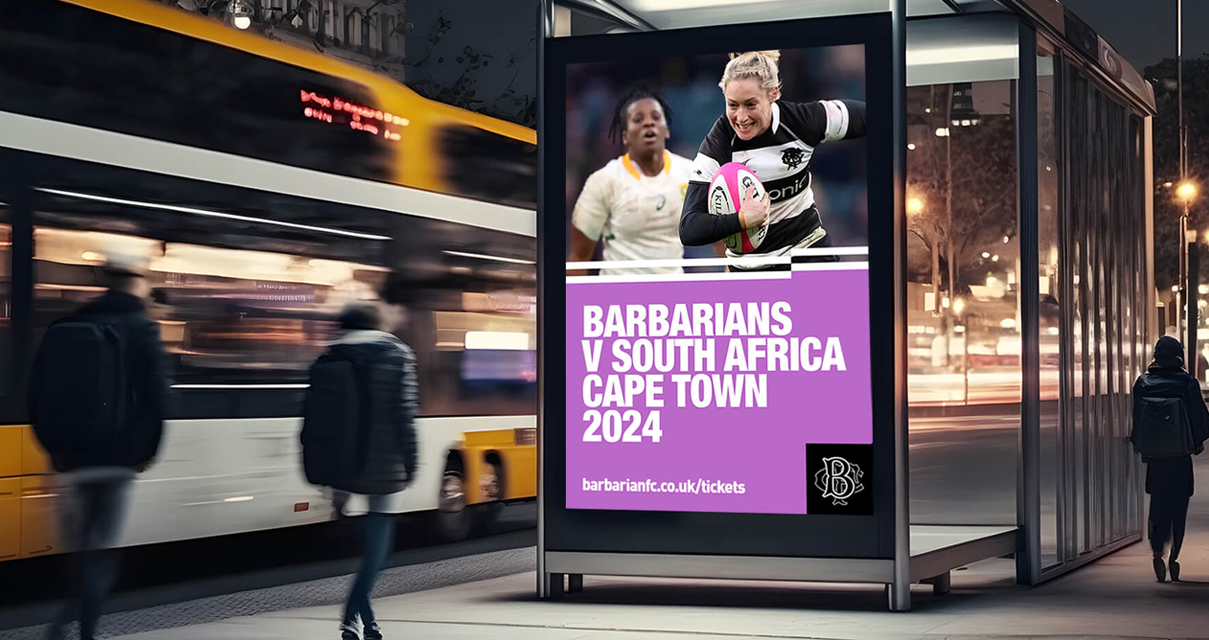
“We’ve given our brand a fresh new look and defined our mission and visual style to reflect this. These brand guidelines are our first edition and provide an essential communication to explain how we should be represented across all digital, social, and print media.
John Spencer Chairman, Barbarians
View the website at barbariansfc.co.uk
Follow Us