

How we created an inspirational identity for a planet centric initiative.
Earlier this year we were delighted to be asked by the Design Council to review and refresh their Design for Planet initiative. A platform for visionaries, designers, businesses and the government to help them lead the way on climate action. The Design Council required a clear brand strategy to extend the initiative’s mission, making it as inclusive as possible, allowing it to exist beyond the Design Council and related events. Our challenge was to make an impactful brand identity to act as a ‘rallying cry to inspire designers, policy makers and commissioners of design to put the planet at the heart of their work.’
Bill Wallsgrove, our Brand Director clarified the brand strategy, positioning Design for Planet as a stand-alone, ingredient brand. The presentation below shows initial sketchbook and development concepts, something we don’t always share, but in this case we had such good fun we wanted to see the full extent of our creative journey.
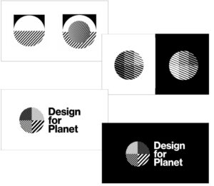

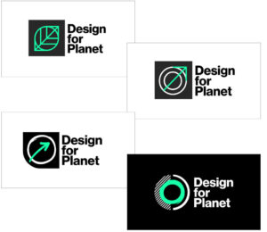
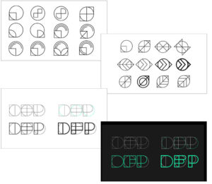
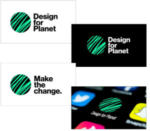
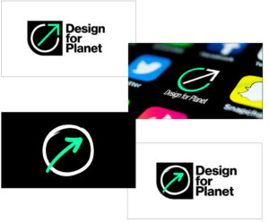
The selected design – inspired by the past
Brand Director , Bill Wallsgrove comments:
“By good fortune I am a visiting lecturer at the University of Brighton where the Design Council Archives are held. I like to start any project with detailed research on the origins of any identity so I took a deep dive into this fascinating historical treasure trove located at the University’s Grand Parade Campus.
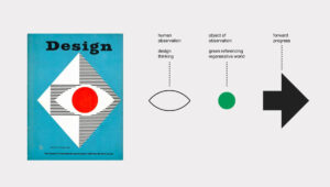
I came across a copy of Design magazine (from the Council for Industrial Design – Issue No.82) from 1955 which had a cover and central feature announcing the new symbol for the forthcoming Design Centre in Haymarket. The Eye (design) and Arrow (forward thinking) symbol was created by Hans Schleger to celebrate the very best of British design. The magazine included a fascinating interview with Hans describing his thinking behind the design and displaying his creative process.
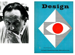
Hans is a fascinating character in British design history who was to be honoured with the title Royal Designer for Industry. He was a freelance designer and illustrator who worked under the pseudonym Zéró.
In 1932 he moved to England, from New York, where he worked for the advertising firm Mather & Crawford before setting up his own practice in 1953. He became an integral part of London’s early 1930s avant-garde design community and helped spread the aesthetics and philosophy of modernism in Britain.
I was fascinated to learn that whilst at Crawford’s he met and became a good friend of F.H.K. Henrion the inspirational poster designer who was my brilliant first tutor at The London College of Printing (now College of Communication), who also has a section of the archive dedicated to his work. Serendipity indeed.
I found Schleger’s Eye/Arrow sketches and detailed explanation a great inspiration for one of my brand identity concepts. I developed an updated version of this original Design Centre symbol and applied it to the Design for Planet logo exploration with a bolder sans-serif Helvetica type application to the side – independent from the symbol to make it more digital first for future applications.
This idea for recycling a classic design from Council archives was really well received by the marketing and design team – very on Design for Planet brand. The designers have now gone on to explore this selected strategic route further refining it closer to the original eye design, but with a contemporary twist for future use, and developed it for applications across media.
This also includes a revival of the swing tag endorsement as originally used at The Design Centre in Haymarket and explored in my first presentation. Back to the Future in action.”
Further information on how the Design Council finalised this project can be found here
For the values and mission of Design for Planet please click here

Follow Us